Hero harmony: Adyen Help transformation
Work
UX, Research, UI
Tools
Figma, Hotjar, Google Analytics, Google Optimize
Date
May 2023
In my role as a dedicated designer in the Adyen Help cross-functional team, I took on the challenge of redesigning the Help Hub to create a more user-friendly and consistent experience. The main objectives were to make Hero sections more compact and ensure consistency throughout the Help Hub, given its emphasis on informative articles and crucial information delivery.
Throughout this project, I served as the designer in a dynamic cross-functional team that included a project manager, product specialist, content writer, and developer, each contributing their expertise to the collaborative effort.
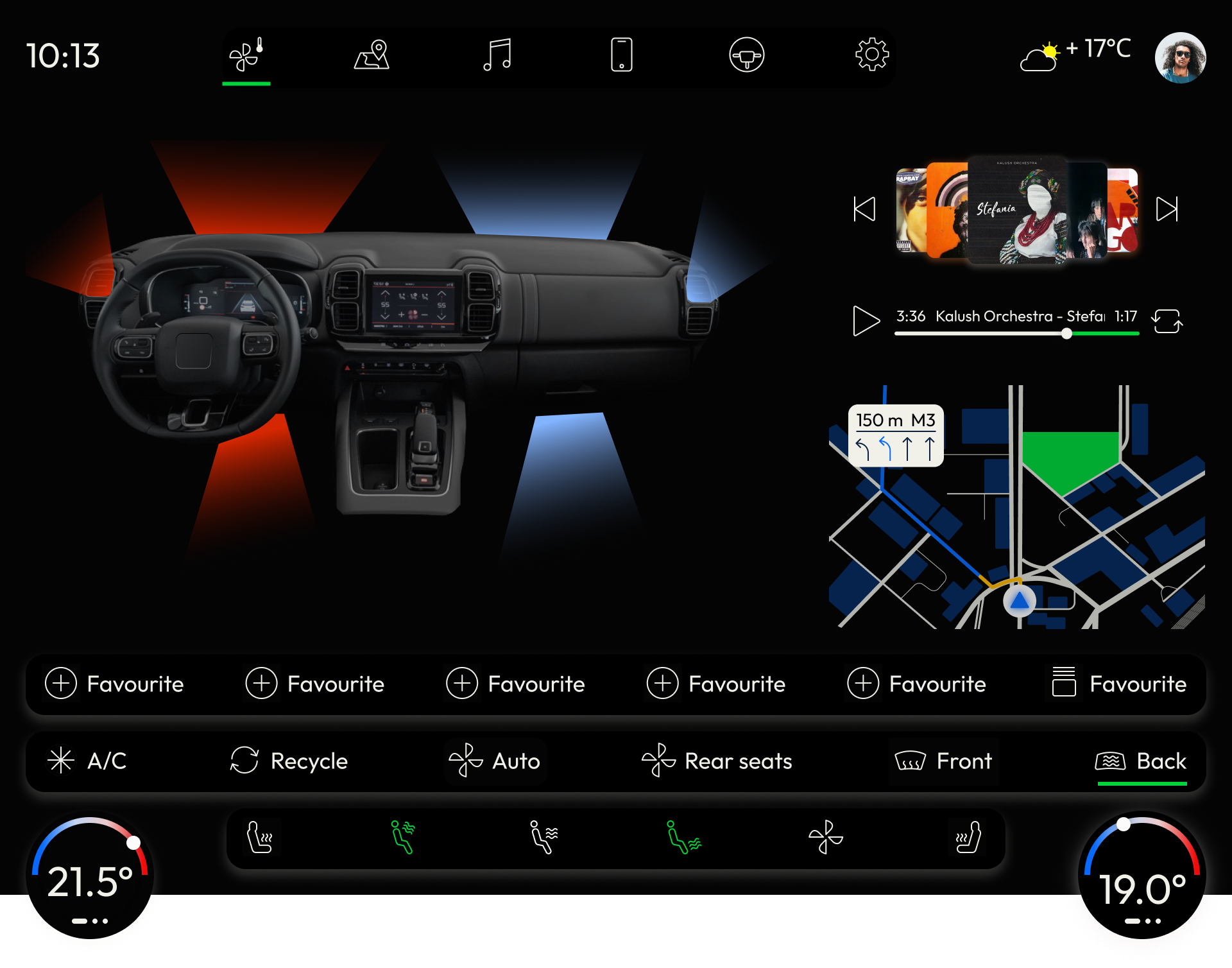
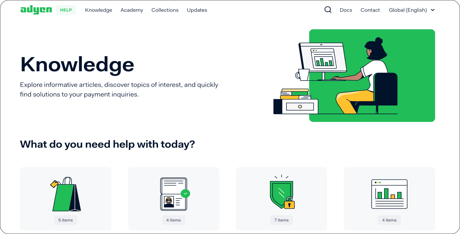
1. Homepage hero sections
- Identified an issue with the Title and Image layout on the homepage, where the first row of cards with main categories was not visible initially.
- Conducted an analysis of popular display resolutions among users and performed a competitor analysis.
- Created wireframes with a centered Title and main category cards visible on the first screen.
- Redesigned the main page layout into 4 columns for improved visibility, replacing the previous 3 or 4 column format.
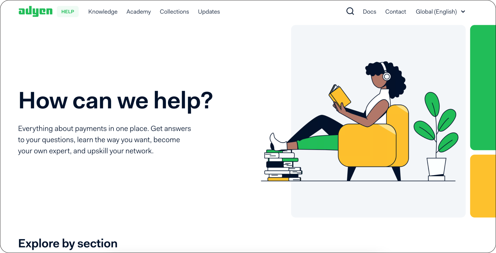
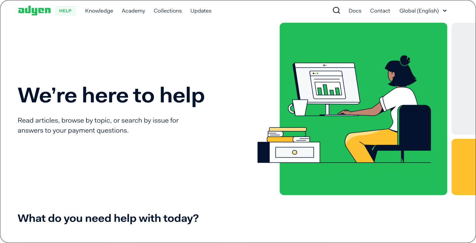
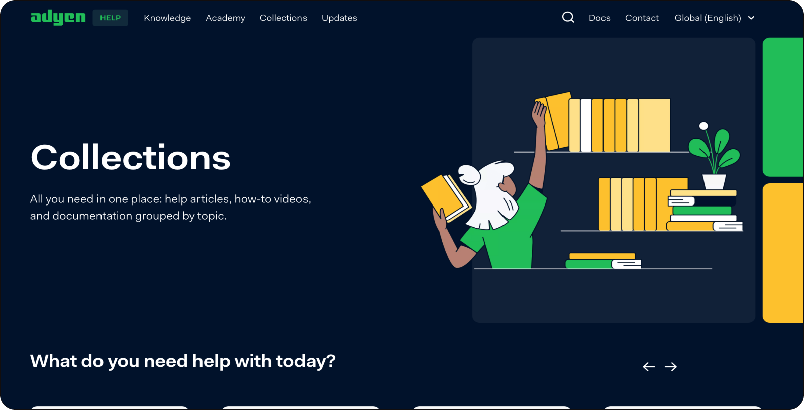
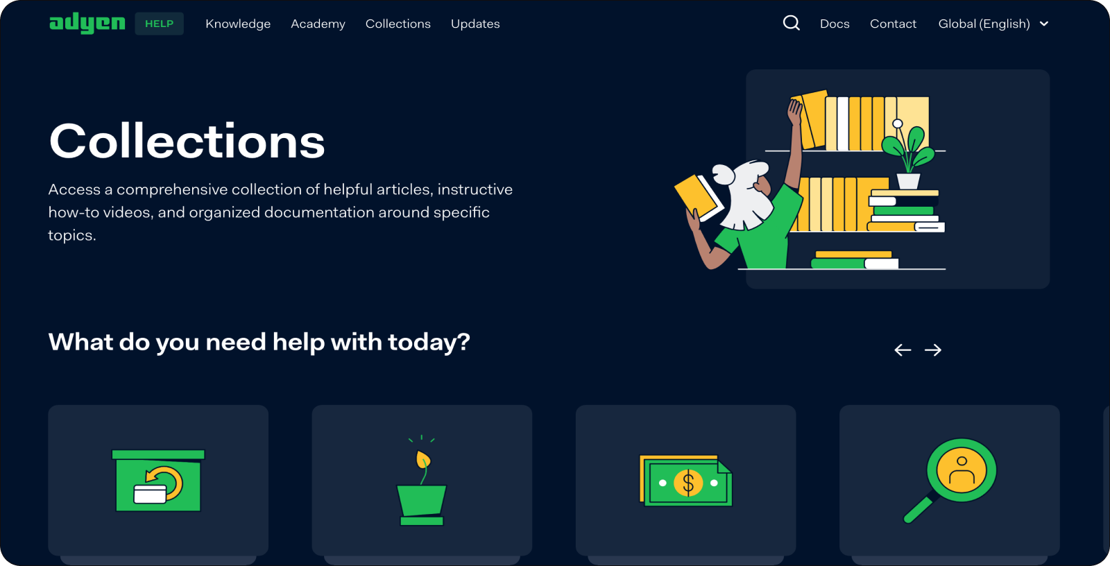
2. Category and subcategory hero redesign
- Standardized Hero sections across category pages (Academy, Knowledge, Collections, and Updates) with a consistent layout.
- Implemented a unified Image size with a 2-column layout for desktops and a 1-column layout for tablets and mobile devices.
- Maintained the same layout for Hero sections on subcategory pages (Risk, Compliance, Payments explained, Reports).
- Assigned dedicated colors for background squares on category pages and utilized a grey background for subcategory Hero sections.
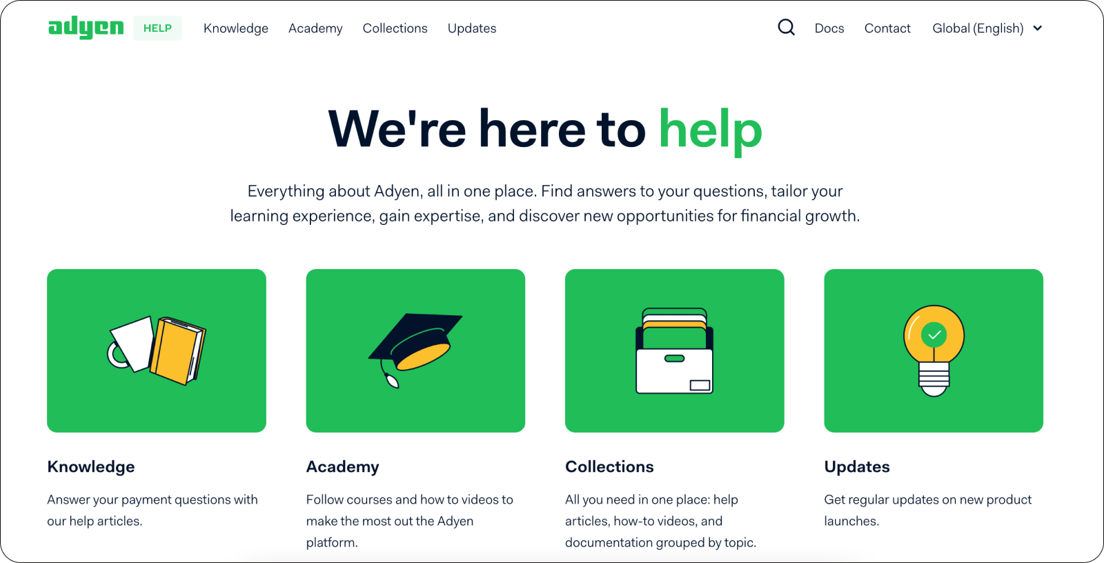
- Introduced Article Heroes with only the title for a more informative content delivery approach.
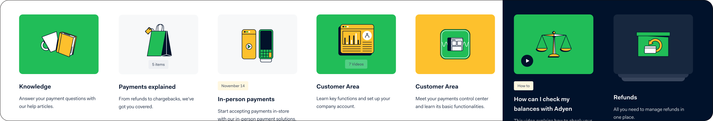
3. Card section redesign
- Following project completion, decided to redesign the Card component to reduce its height.
- Divided the project into stages, including resizing illustrations to 110 px (from 140 px) and adjusting paddings and margins.
- Designed a versatile Card component with variations for category links, webinars, videos, courses, and collections.
- Included features such as booleans for tags, date tags, play buttons, color selection, image swap, and the ability to add a variable number of cards rows for easy scalability.
Compiled all elements, components, and resized images into a new digital library, now actively used by developers.
No items found.