East-West Connect: trade project
Work
Tools
Date
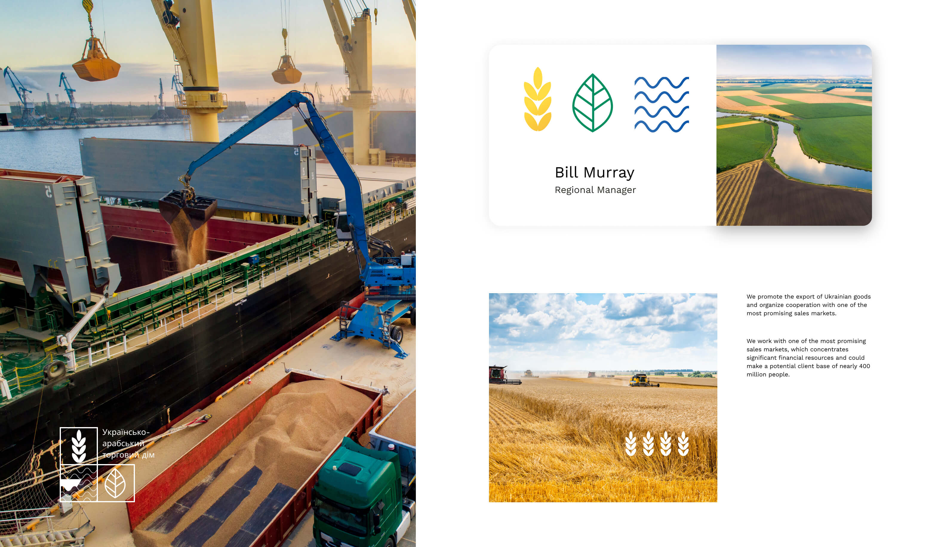
The Ukrainian-Arab trade house facilitates the export of high-quality Ukrainian agricultural products to the Arab world, tapping into a potential client base of nearly 400 million people and capitalizing on Ukraine's favorable geographical location and competitive agro-product market.
Branding
The branding aims to establish a strong and distinctive presence in both Ukrainian and Arab markets while promoting agricultural trade and cooperation.
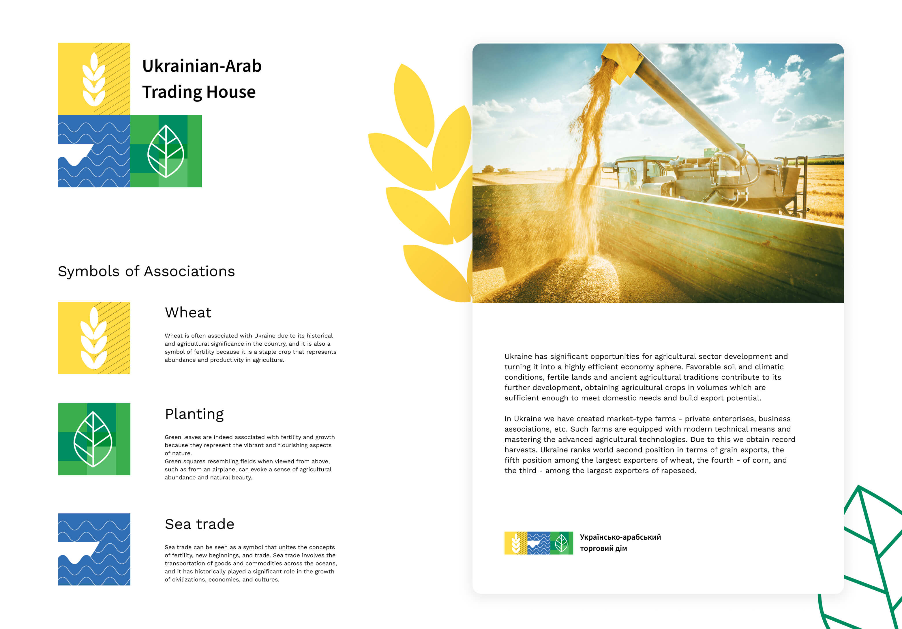
A branding concept offered for a Ukrainian-Arab trade house: symbols and colors for the logo seems well thought out, with wheat representing the agricultural sector, the leaf symbolizing growth and prosperity, and the blue water symbolizing trade and connectivity.
Logo Design
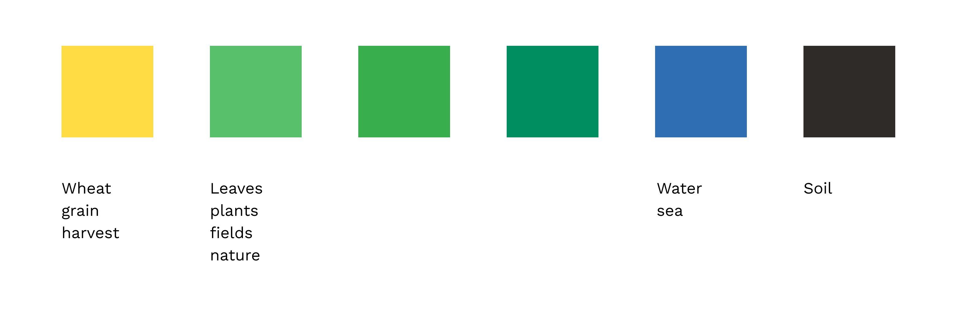
A visually appealing and symbolic logo that incorporates three key elements — wheat, leaf, and water (represented by yellow, green, and blue colors, respectively). The logo effectively communicates the trade house's mission and values.
Color Scheme
I defined and harmonized the color scheme, ensuring that it conveys the essence of agriculture, growth, and trade while appealing to the target audience in both regions.
Versatility and Adaptability
I meticulously crafted a logo that maintained its visual impact across various platforms, from business cards to banners, and created black and white versions to ensure adaptability in different settings.
Graphic elements from the branding can be utilized independently and seamlessly integrated into high-resolution photographs that align with the overall branding concept, effectively conveying the brand's identity and style.
Marketing Collateral
I extended the branding to encompass a comprehensive range of marketing materials, including bilingual brochures, a bilingual website, and engaging promotional videos. This cohesive approach ensured a consistent brand presence.
Website
The website's primary objective is to showcase Ukraine's vast agricultural potential, highlighting the opportunities and products within its agricultural sector. Additionally, it aims to provide comprehensive information about our company and the services offered.
Creating the website involved several stages
1. Planning and Research
Conducted in-depth research to understand the website's purpose, target audience, and industry landscape. Developed a comprehensive sitemap to structure the site effectively.
2. Wireframing and Prototyping
Created wireframes to visualize layout and content placement. Crafted interactive prototypes to map out user interactions and journeys.
3. Design
Designed the website's visual elements, including color palettes, typography, and imagery. Produced high-fidelity mockups to capture the final look and feel.
4. Content Creation
Curated and generated content, including text, digital assets, images search and other media. Ensured content aligned seamlessly with the website's goals and user experience.
5. Building the Website
Constructed the website's structure and layout using Weblium visual editor. Added essential elements, such as headers, footers, navigation menus, and content sections. Customized styles, animations, and interactions to enhance user experience.
6. Responsive Design
Ensured responsiveness by crafting layouts for various devices (desktop, tablet, mobile). Conducted thorough testing and fine-tuning to ensure optimal display and functionality on all screens.
7. Basic SEO Optimization
Optimized on-page SEO elements such as meta tags, headings, and image alt text.
8. Review and Feedback
Solicited feedback from stakeholders and incorporated suggested revisions.
9. Testing and Performance Optimization
Conducted performance tests to improve page load times. Implemented image compression.
10. Domain Setup
Connected the domain to Weblium. Configured DNS settings for seamless integration.
11. Launch
Successfully published the website to the chosen domain. Monitored the website for post-launch issues and swiftly addressed them.
Check live website.
.jpg)
.jpg)
.jpg)
.jpg)
.jpg)
.jpg)
.jpg)
.jpg)
.jpg)