Coinfinity: Brand Identity, Website & App Design
Work
Tools
Date
Coinfinity is a conceptual fintech project designed to create a modern and secure digital experience. The project includes a bold brand identity, a user-friendly website, and an intuitive app interface, blending innovation with clarity. Though Coinfinity is not a real company, this project showcases a future-forward approach to fintech branding and UX/UI design.
Logo & Branding
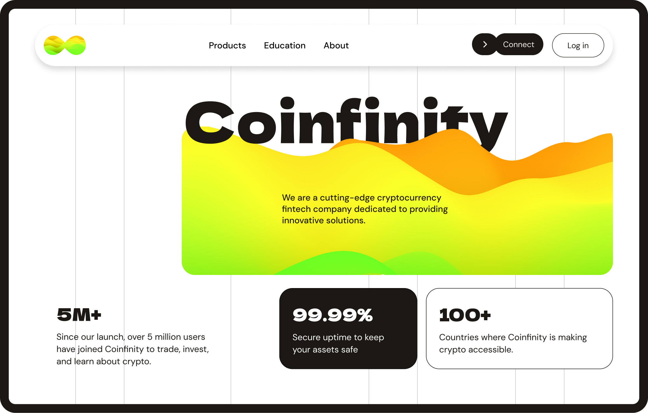
The Coinfinity logo combines an infinity symbol with flowing gradient waves (green to orange), representing financial growth, seamless transactions, and continuous innovation. The design reflects movement and stability, essential qualities for a fintech brand.
The color palette plays a crucial role in reinforcing trust and dynamism.
Typography is bold and clean, enhancing readability and creating a strong visual presence. The brand identity extends to iconography, layout styles, and visual elements that ensure a cohesive experience across all touchpoints.
As part of the branding, I designed a poster for Coinfinity Conf, maintaining the project's bold, modern style. The poster integrates the gradient waves, typography, and color scheme, creating a cohesive extension of the Coinfinity brand while emphasizing fintech innovation.
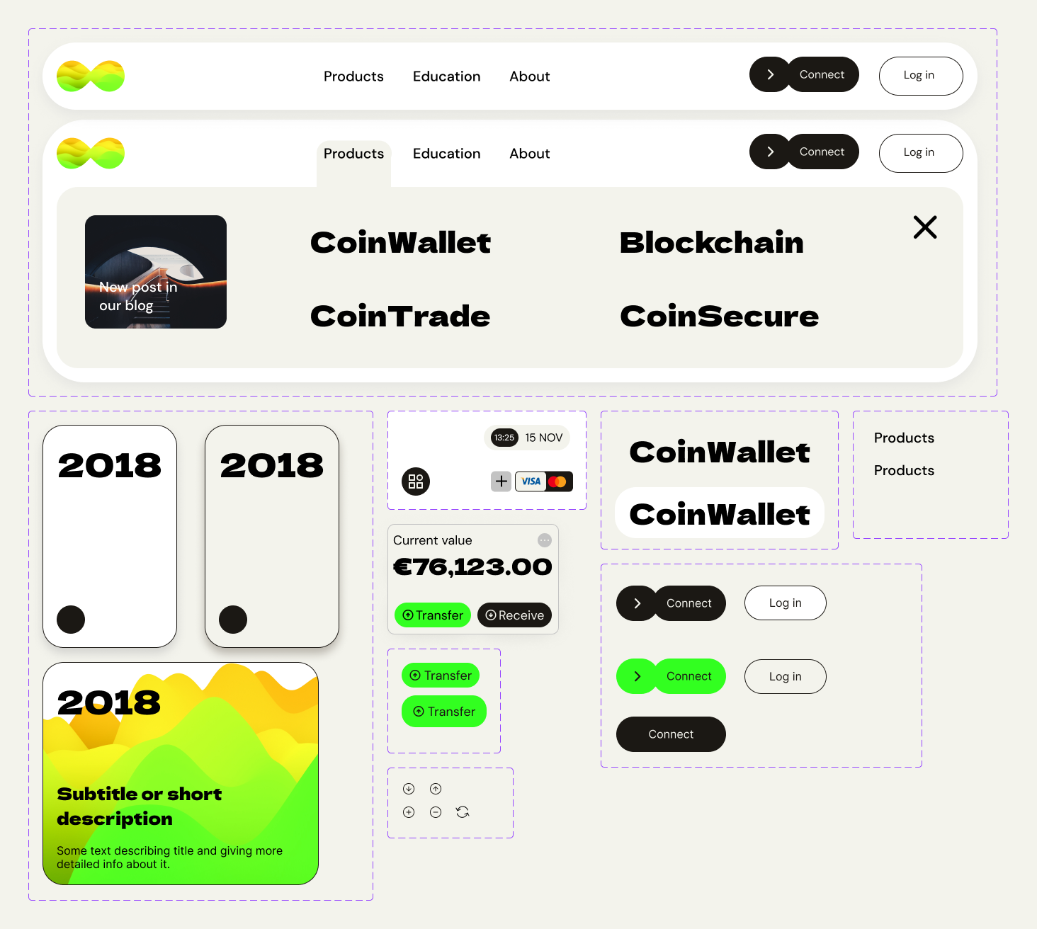
Icons & cards
To ensure a smooth and intuitive user experience, Coinfinity relies on clear iconography and a structured card-based system for information presentation.
1. Custom Icons – Designed with simplicity and recognizability in mind, icons enhance navigation and visually differentiate content categories. They are clean, minimalistic, and consistent with the brand’s bold aesthetic.
2. Information Cards – The UI is built around modular cards that contain all necessary details while maintaining a clean, easy-to-scan structure. Cards help break down complex financial data into digestible sections, ensuring a seamless flow of information.
3. Interactive & Responsive – Cards adapt dynamically based on user interactions, providing hover effects, expandable sections, and smooth transitions for a more engaging experience.
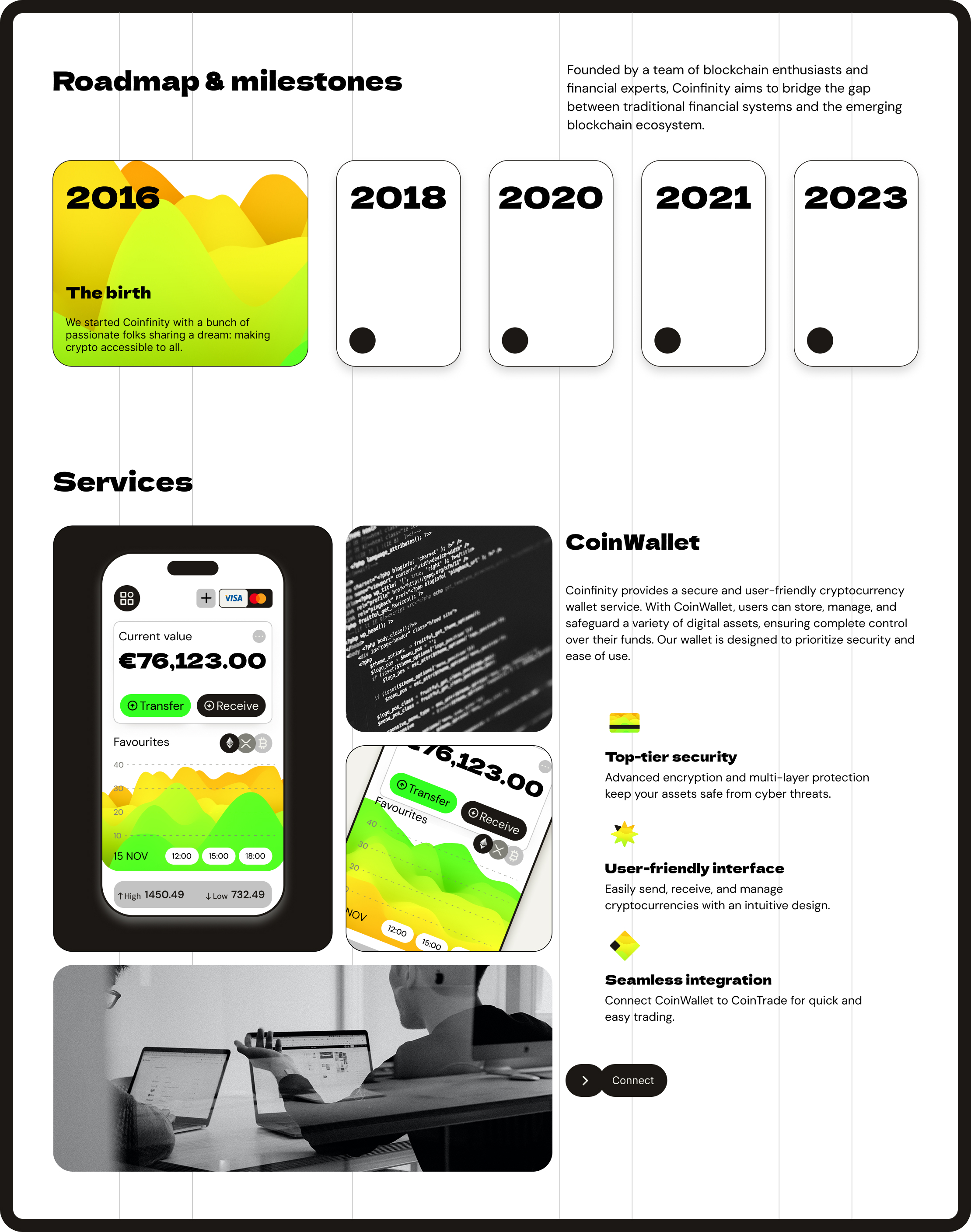
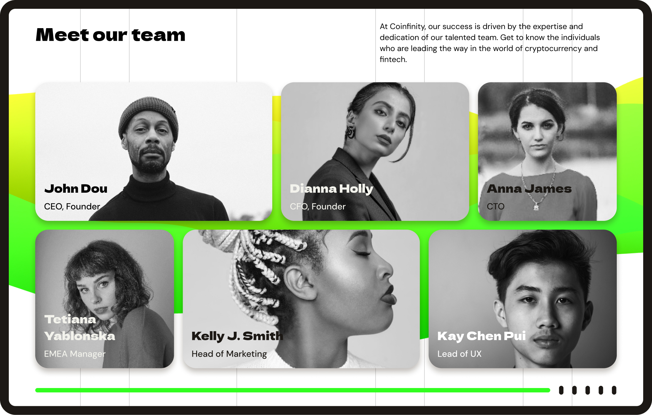
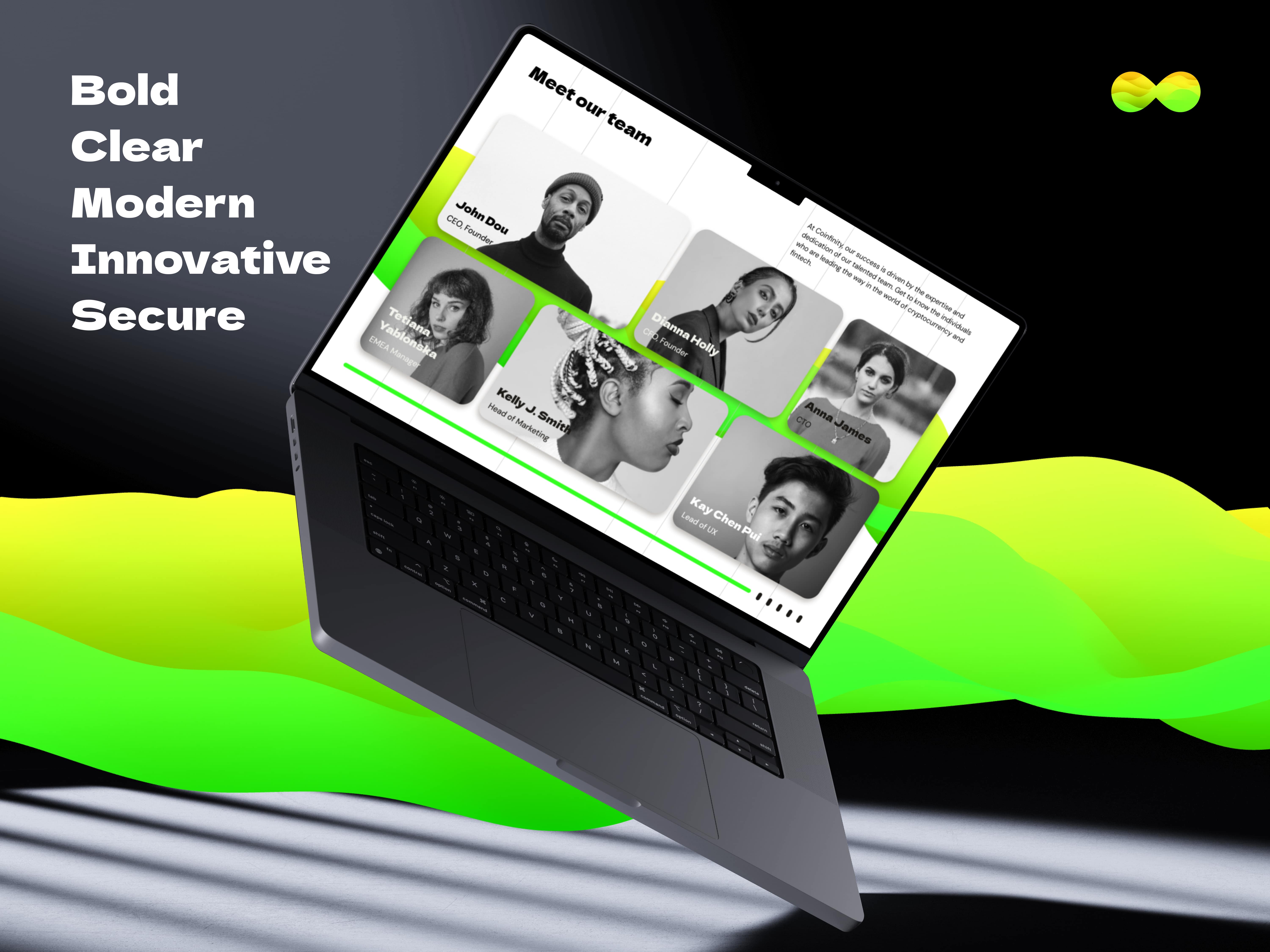
Website Design
The Coinfinity website is structured to deliver information clearly and efficiently, following a modular card-based layout. Black-and-white images contrast with the vibrant gradients, making the interface feel modern yet trustworthy. The layout ensures:
- easy navigation with well-structured sections
- smooth responsiveness, adapting seamlessly to all screen sizes
- clear call-to-actions, guiding users toward essential actions
- minimalistic design, avoiding unnecessary clutter while enhancing readability.
The website's visual hierarchy ensures users quickly grasp key information while being engaged by the brand’s dynamic elements.
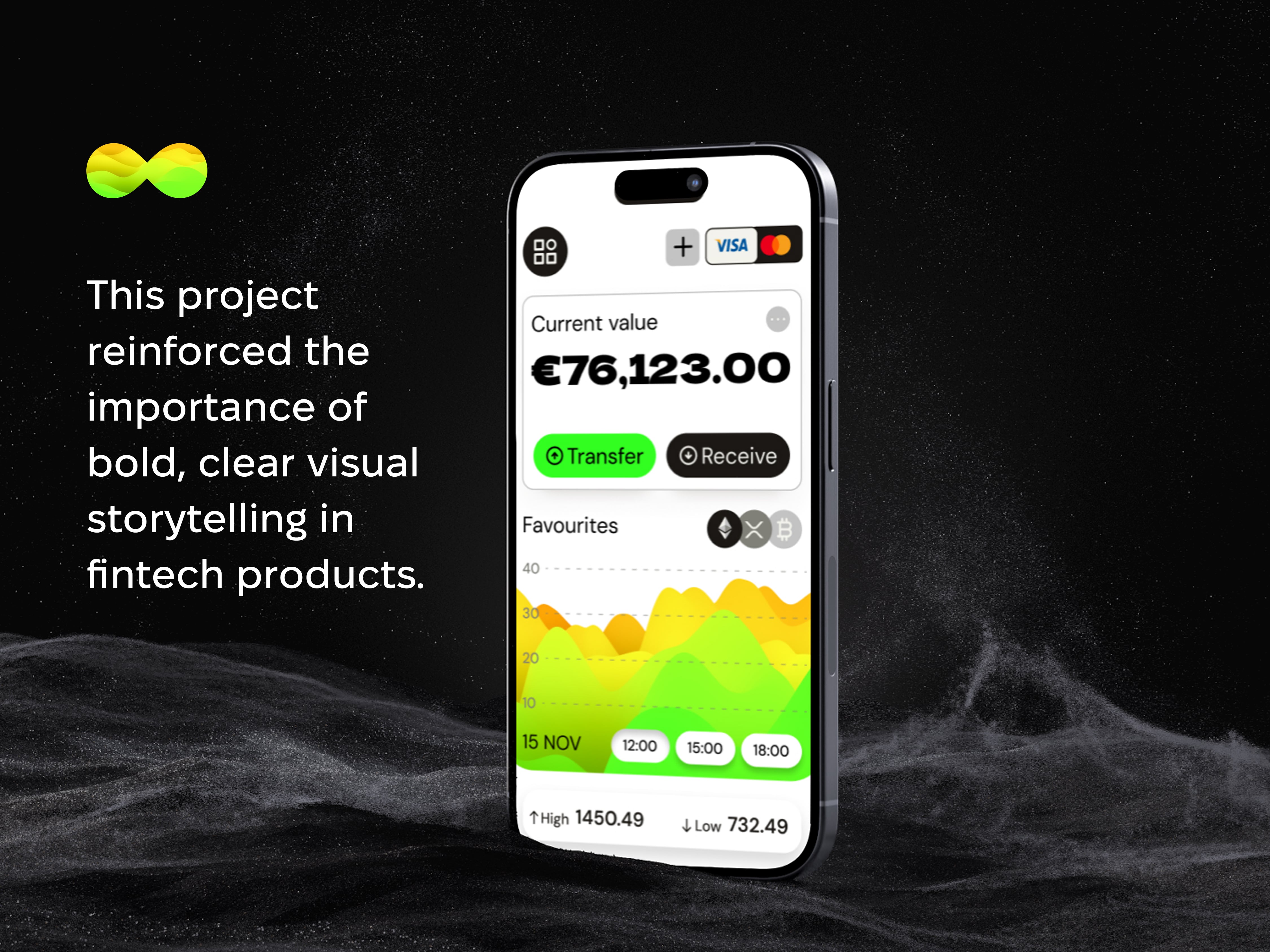
App Interface
The Coinfinity mobile app is designed for simplicity and ease of use, ensuring a smooth financial management experience. Key UI features include:
- card-based information display for clarity
- bright gradient highlights to guide user attention
- intuitive navigation, making financial interactions effortless
- seamless dark/light mode adaptation for user preference.
The app design prioritizes usability, making complex financial processes accessible while maintaining a sleek, modern aesthetic.
Final Thoughts
Coinfinity is not a real company, but this project showcases a vision for future-forward fintech branding and UI/UX design. By blending a strong visual identity, structured layouts, and an intuitive user experience, the design ensures clarity, engagement, and a sense of trustworthiness—essential for any financial platform.